
Why Luxury Brands Still Rely on Gold in Their Visual Identity
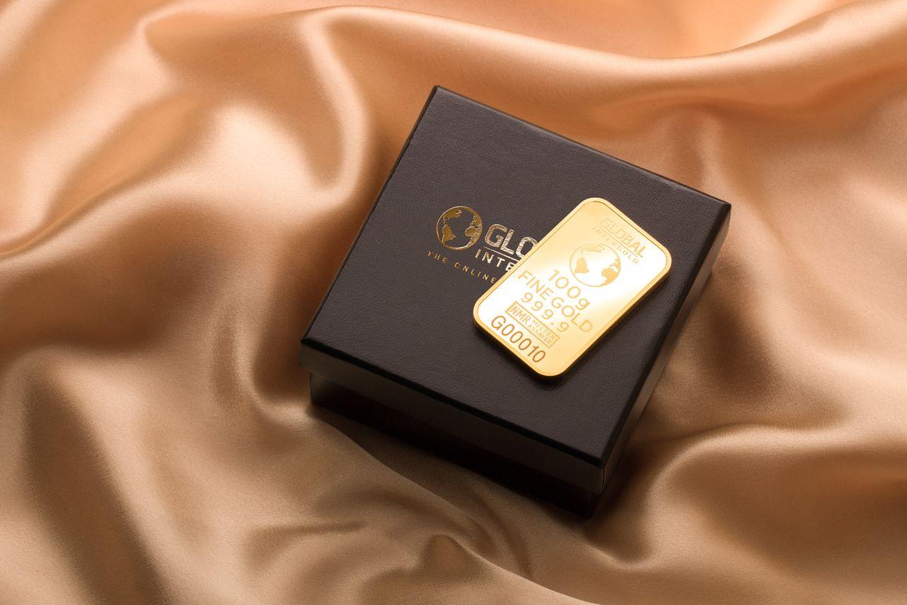
Gold has been associated with wealth and prestige for centuries, but its influence extends far beyond jewelry and expensive accessories. This article explores why luxury brands continue to use gold in their logos, packaging, stores, and advertising, even as design trends move toward simplicity.
Gold Communicates Luxury Without Saying a Word
Walk into a luxury boutique, and there is a good chance you will notice gold somewhere. It might appear in the lettering above the entrance, the edges of a display case, or the small details on a product's packaging.
These choices are rarely accidental. Gold has a long history of being associated with wealth, power, and achievement. From royal crowns to historic palaces, the metal has traditionally represented something valuable and difficult to obtain.
Its financial importance also remains relevant today. Investors regularly follow a gold price forecast to understand how economic conditions might affect the metal's value. Although luxury branding operates differently from financial markets, both reflect the widespread perception of gold as something precious.
For designers, this association is particularly useful. A small amount of gold can make an ordinary object appear more expensive without changing its shape or function.
A Color With Centuries of History
Luxury brands often build their identities around tradition, craftsmanship, and exclusivity. Gold fits naturally into this approach because its cultural significance stretches across different civilizations.
Ancient Egyptians used gold in jewelry and ceremonial objects, while European royalty incorporated it into clothing, furniture, and architecture. Religious buildings also featured gold decorations to communicate importance and grandeur.
Modern luxury companies benefit from these historical associations, even when customers are not consciously thinking about them.
A gold emblem on a handbag or watch can suggest a connection to traditional craftsmanship. Similarly, gold lettering on a perfume bottle may create the impression that the product belongs to a long-established luxury house.
The color provides a visual shortcut to ideas that would otherwise require considerable explanation.
Why Gold Works So Well With Other Colors
One reason gold remains popular among luxury designers is its versatility. It can create very different impressions depending on the colors surrounding it.
Black and gold are perhaps the most recognizable combination. Black provides a restrained background, allowing gold lettering or decorative details to stand out without making the overall design feel excessively colorful.
White and gold create a softer impression, frequently associated with premium beauty products, skincare, and elegant interiors.
Deep green, navy blue, and burgundy can also complement gold, producing a richer appearance that works particularly well for watches, fragrances, and high-end packaging.
However, the amount of gold matters. Too much can make a design appear flashy rather than sophisticated. Many luxury brands therefore use it sparingly, allowing a logo, border, or small metallic feature to attract attention.
Packaging Makes the Experience Feel Special
Luxury shopping involves more than the product itself. The experience of receiving, opening, and displaying an item can influence how customers perceive its value.
Consider two identical perfume bottles. One arrives in a plain cardboard box, while the other comes in carefully designed packaging with embossed gold lettering and a textured finish.
The fragrance may be exactly the same, but the second presentation can feel considerably more exclusive.
Luxury brands understand this distinction. Packaging is often designed to make customers feel they are purchasing something special rather than simply another consumer product.
Gold foil, metallic printing, and subtle reflective surfaces can reinforce that impression. They also photograph well, an important consideration when customers share purchases on social media.
For some products, the packaging becomes part of the experience customers remember.
Gold Helps Brands Remain Recognizable
Luxury companies face an interesting challenge. They need to remain fashionable while preserving an identity that customers recognize across generations.
Constantly changing a brand's appearance can weaken that recognition. Gold offers a relatively timeless design element that can survive shifts in typography, photography, and advertising styles.
A fashion house might introduce a more modern logo or redesign its stores while retaining familiar gold details.
This consistency matters because luxury customers are often buying into a brand's history as much as its products.
Even younger consumers who prefer minimalist design may still recognize gold as a symbol of premium quality. The challenge is using it in ways that feel contemporary rather than outdated.
Why Gold Is Unlikely to Disappear
Luxury design will continue evolving as consumer preferences change. Some brands may experiment with silver, neutral colors, or completely minimalist identities.
Yet gold retains an advantage that few other colors can match: people have associated it with value for thousands of years.
That connection gives luxury companies a familiar visual language they can adapt without constantly reinventing their image.
Whether it appears on a watch dial, shopping bag, fragrance bottle, or storefront, gold remains a powerful way to communicate prestige. Its continued popularity is not simply about tradition, but about how effectively a small visual detail can shape the way customers perceive a brand.