
Cannabis Brand Packaging and Label Design Trends (A Loose Fit, So Keep It Branded)
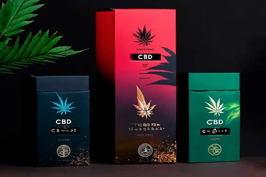
Cannabis packaging has now transformed from just a simple container to a premium design that creates brand identity. Now brands consider premium packaging to position their products in the industry and communicate with customers before opening their products. From simple designs to bold illustrations, packaging is helpful for brands to stand out in the competitive market.
At the same time, brands must consider balance in creativity, functionality, and local rules. As the requirements for packaging may vary from place to place, brands working in California State must check the applicable laws for packaging and labeling along with visual appeal. However, if you are looking to find the best brand, then check out Dr. Ganja CBD shop for the best collection. Their design is aesthetically appealing, functional, readable, and consistent.
Further, we will check out the latest packaging and CBD brand label designs and trends that steal the show!
Why Minimalist Packaging Is Becoming a Strong Branding Choice?
Simple and minimalist packaging is now popular among different cannabis brands that want a unique, simple, and clean appearance. Rather than adding graphics and promotional materials in empty spaces, brands must select the right typography, clean layouts, and visual hierarchy for a more polished appearance.
Customers prefer minimalist packaging as it makes the information easy to understand. The proper presentation of important details instead of just adding extra materials can make the packaging more organized and intentional.
Clean Typography and Simple Layouts
Typography is the main recognizable element in packaging designs. A unique typeface, proper spacing, and right placement of brand details help customers easily recognize the brand even in different formats.
A brand must use consistent typography in different packaging, boxes, cards, and online materials. It creates visual consistency in each product even if the categories are different.
Neutral and Refined Visual Styles
Now many brands are switching from stereotypical cannabis images towards a clean visual appeal. Neutral backgrounds, minimal elements, clean typography, and subtle illustrations are important to ensure the packaging’s originality and appeal.
This approach is helpful for brands looking for quality and design instead of just adding many symbols. The main goal is to make packaging simple and affordable as well as unique.
Making Information Easy to Find
As we know, many THC Gummy Brands prefer to use minimal designs and typography. But Minimalist design does not mean removal of helpful details. Proper packaging may differentiate branding from essential details via clear sectioning and visual hierarchy.
When customers can find out the name, type, quantity, and relevant details about certain products, the packaging becomes easy to identify without losing identity.
How Bold Colors and Illustrations Help Brands Stand Out?
Though minimalist packaging is famous, not all cannabis brands prefer it. However, they prefer to use bold colors, impressive illustrations, and unique artwork for the creation of packaging that instantly grabs attention.
Color theme is mainly important when the brand has to offer different products and varieties. A consistent design with different colors helps customers to differentiate products while maintaining the identity.
-
Color as a Product Identifier
A brand may assign a certain color to a variety of products and formats. Let’s take an example: a single color may also represent the flower family and the pre-roll category at the same time.
Consistency is mainly important to consider. When the brand uses colors randomly, it may cause confusion instead of recognition. A proper color theme makes it easy for customers to find a certain product line.
-
Illustrations Create Brand Personality
Illustration is also useful to create memorable cannabis packaging. Botanical artwork, unique designs, characters, patterns, and visual elements are all used in creating the unique brand identity.
The illustration must match the audience’s needs and positioning. A stronger illustrated design may connect well with customers even if the products are from different categories.
-
Creating a Recognizable Shelf Presence
Packaging is the main factor to attract the attention of customers. A unique blend of colors, typography, images, and packaging shape allows a brand to create a unique presence.
However, creating a unique identity does not mean brighter and more complicated packaging. Stronger branding is the result of a unique visual identity that grabs the attention of customers, even across different products.
Should Cannabis Packaging Always Use Green or Traditional Cannabis Imagery?
Not at all. Green leaves and famous cannabis images are not required for creating cannabis packaging. Most brands go with alternative visual appeals as they are interested in creating a unique identity in the market.
However, a brand may use plant illustrations, patterns, geometric shapes, typography, and photography. The most important thing is that the visual direction must remain consistent and appropriate for customers.
Switching off the predictable imagery also allows the brand to stand out. If many brands use the same leaves, colors, and graphics, then it is better to use a unique identity to help customers remember.
How Can a Cannabis Brand Make its Packaging Look Premium?
To create a premium look, it is not necessary to add more graphics or expensive materials. Premium packaging may involve attention to each detail, quality of design, material selection, typography, spacing, and consistency.
A proper layout with better typography and consistent visual appeal seems more attractive compared to packaging with just decorative material. At the same time, physical detailing leads to quality when it improves the experience.
Brands should ensure premium packaging without interfering with readability. Important information must be clear and accessible without adding extra visual elements.
What Should Brands Consider Before Redesigning their Cannabis Packaging?
A brand must consider its goals and objectives while redesigning the cannabis packaging instead of just sticking to graphics and colors. Companies must identify their weak points in designing and figure out how customers can recognize the product, which materials should feel consistent, and how the design will work.
Also, brands must check the practical side of redesigning. As there are a variety of products, each product may require different design, packaging, formatting, materials, layout, and size. A design that seems appealing on one product is not necessarily going to work well with other formats.
At the end, regulatory elements must be added before the final finishing. Packaging and labelling may differ in each market, so companies must check rules for the specific location. Considering all such requirements in the design process may help brands avoid costly redesigning later.
What Makes Cannabis Packaging Visually Appealing to Customers?
Cannabis packaging is visually appealing due to a combination of different design elements instead of just one element. Packaging structure, image, spacing, color, consistency, and typography are the elements that give an appealing look to packaging. A stronger design gives purpose to each element and avoids unnecessary clutter in the packaging.
The Importance of Visual Hierarchy
Visual hierarchy is helpful for users to know what they are looking at. Information about the brand allows users to recognize it, while product details help them to differentiate one product from another. The logical arrangement of all such elements makes packaging more informative and avoids overwhelming users.
Creating a Memorable Brand
Memorable branding is another main factor to consider. Though customers look at different packages from different brands, a unique logo, style, typography, and color are important and can help the brand stand out among all.
Commonly, appealing designs remain consistent across different products of the same company. So when customers buy products from the same brand, they start to know and recognize the brand.
Making a Flexible Design System
The perfect packaging design covers typography, logo, color, style, spacing, information, and photography. All these elements are helpful in creating the base for a variety of packaging sizes and product categories.
Let’s take an example: the placement of the logo stays in the same place, but typography changes across different products with the same background. So it helps customers to recognize the brand even in variety.
Conclusion:
Cannabis packaging is the most important step for improving brand recognition and consistency across different products. Whether the brand goes with minimal packaging, unique colors, bold illustration, typography, or premium style, the best packaging designs always have the core purpose behind each visual appeal. Packaging must be helpful for customers to recognize the brand and to know all the essential details about the product.
Functionality and compliance are mainly essential. Appealing packaging still needs to give all the necessary details. Those brands that prefer minimal packaging understand that meeting the needs of customers is their primary goal. Thus, with appealing minimal packaging, they protect the product in the market where it is sold. Brands working in California and other states must check rules from the start of the packaging process.
In the end, strong packaging means creating consistent branding instead of just following the market trends. With the development of the cannabis industry, brands should combine visual appeal with functionality, clear detailing, premium materials, and consistency to create the strongest packaging that feels unique to customers.