
Wanted Font Style Guide for Bold Creative Projects
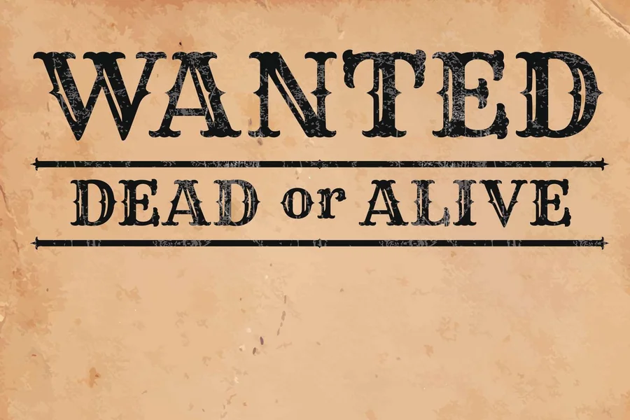
Wanted font is very dramatic and powerful as it captures the attention easily. It has been influenced by vintage Western posters and outlaw reward notices of the west and has a rugged appeal that is bold and movie-theater like. When designers want to have something that appears to be powerful, vintage or rebellious, they usually resort to it.
Simple text can be made an eye-catching visual object using this font type in event flyers to branding projects. Here you will get to know where it fits in best, how to combine with other type faces, what to do with it to get good results without overpowering your design.
The Origins and Visual Identity of Wanted Font
The typographic style of the Wanted closely resembles the imagery of the American Old West. Imagine wooden saloon doors, dusty towns, and pinned up posters on walls which declare a reward. The types are heavy, slab serif, and to a small degree ornamental. It also has some variations such as distressed textures which simulates old paper or ink.
Its identity is created on strength and clarity. Thick strokes and powerful edges regularly appear on the letters, and thus they can be easily seen even when at a distance. Such is one of the reasons why the style gained popularity on poster and signage.
As time went by, designers changed the appearance into digital versions and could now be used in websites, merchandise, and social media graphics. The style has changed though it is based on history. Nowadays, minimalist layouts are available in cleaner variants and art with a vintage theme is available in heavily-textured forms.
Where Wanted Font Works Best
Such bold typeface is not always required in a project. The Wanted font works best in the designs where it is needed to be individual and impressive. Posters are a natural fit. This style catches the eye either when you are making a themed party invitation or a promotional banner.
Another area that it does well is branding. This typeface is used in logo or packaging by businesses that wish it to have a rustic, adventurous or retro appearance. It is an indication of confidence and tradition simultaneously.
Another commonly used use is in merchandise design. Bold typography on T-shirts, mugs and stickers can be distinguished in busy markets. Short phrases and slogans are easier to remember since the font is dramatic.
But it is not as appropriate with long paragraphs and body text. The thick strokes and ornamental borders have the capability of lowering readability in the long form of reading. That is why such a rule is generally applied by designers to headlines, titles, or brief statements.
How to Pair Wanted Font with Other Typefaces
The fonts used can be matched, which can either ruin or enhance a design. Since Wanted font is high-profile, it is only effective when mixed with a simpler font. A clean without serif font would be able to give contrast and enhance readability.
The other good combination is the light serif font. This maintains a classic sound but does not make the design seem like it is weighted. The key is contrast. When the fonts used are bold and ornamental, the design can be cluttered.
Hierarchy also matters. Headlines or important phrases should be written using Wanted font. Allow the secondary typeface to do the description, detail, or text that is longer. This design is in the form of a natural movement of the eyes through the layout.
The distance is also significant. Provide the audacious letters with space. To make type clearer, you can just add a little bit of space between the letters, particularly in big headings.
Using Wanted Font in Digital Design
Clarity and responsiveness is imperative in digital space. The Wanted typeface can be impressive on websites and social media illustrations, though the artists should be concerned about scale. Big headers are efficient in desktop screens. On smaller devices, the size ought to be set down to a level that will accommodate readability.
Contrast of the colors is also essential. Since this font is frequently characterized by heavyweight lines, it is possible to increase its effect with the help of bold coloring. Light background Dark text is good when one wants to have a classic poster look. Dark text on light backgrounds may have a dramatic, contemporary effect.
Licensing and file format should not be disregarded. There are numerous variants of the font both free and paid. Usage rights should always be checked before inclusion of usage rights into any commercial project.
The other creative opportunity is animation. Bold headline text can be animated in video intros or as a digital advertisement to increase its engagement. A fade-in or slide effect can be used in such a way that important messages are highlighted without burying an audience.
Read More: Verdana Font – A Clear Choice for Screen Design
Common Mistakes to Avoid
Even a strong font such as Wanted font will not be effective when used wrongly. Overuse is one of the errors. Excessive textual decoration on a design makes it less readable, as it fills the entire design with heavy content.
The other problem is that of ignoring context. Although the style suits to Western subject matter quite well, it might be inappropriate to use in a corporate or very formal document. Never wear such a unique appearance without thinking about your readers and what you need to say.
The design may also be poor due to poor selection of color. The bold letters can be difficult to read in case the background is too busy or there is no contrast. Backgrounds should be simple when using decorative fonts.
Finally, do not stretch or distort typeface. Changing ratios will hurt its personality and professionalism.
Creative Ideas for Modern Projects
The Wanted font is no longer only cowboy based. Today designers play with the diversity of mixing it into the unpredictable scenes. With the integration of modern colors, it can be blended to form a blend of vintage and contemporary arts.
The other concept is subtle textures. To add more nostalgic to the design, a grain or paper effect can be added to the design without being perceived as being dated. This method is particularly effective in print work.
This bold typeface can also be used in minimalistic layouts. The visual effect of having one large headline in the center of a plain background is really impressive. Sometimes less truly is more.
Another artistic device is superimposition. When contrast is preserved then it is possible to create cinematic appearance by placing the headline on top of a scenic photograph.
Final Thought
The Wanted font will always be a classic among designers who wish to make a statement. Its vintage poster craftsmanship makes it own character and identity. Simultaneously, its flexibility enables it to blend in with contemporary creative endeavors without any problems.
It is very powerful visually when applied strategically in the headlines, branding or promotional materials. With a combination of complementary typefaces, correct spacing, and consideration of readability, you can use its potential to its maximum.
FAQs
What is Wanted font commonly used for?
It is commonly used for posters, headlines, logos, themed invitations, and merchandise designs that require a bold and vintage appearance.
Is Wanted font suitable for body text?
It is not ideal for long paragraphs because its heavy and decorative style can reduce readability over extended text.
Can Wanted font be used for commercial projects?
Yes, but you must check the specific license of the version you download to ensure commercial use is allowed.
What fonts pair well with Wanted font?
Simple sans serif or light serif fonts pair well because they balance the bold and decorative nature of the headline style.
Does Wanted font work in modern digital designs?
Yes, when used carefully with proper scaling, spacing, and contrast, it can look strong and effective in websites and social media graphics.
How can I make Wanted font more readable?
You can improve readability by increasing letter spacing slightly, using high color contrast, and limiting its use to short headings or phrases.