
The Architecture of Appetite: Designing Menu Typography to Drive High-Profit Restaurant Sales
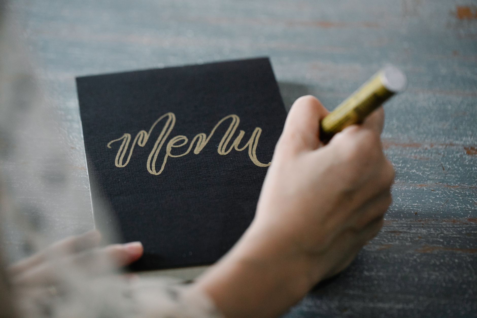
Typography dictates the price a diner expects to pay before food ever hits the plate. When a customer reviews a menu, the visual structure of the text triggers automatic psychological assumptions about flavor, portion size, and ingredient quality. A heavy, bold sans-serif font communicates ruggedness and high caloric density, making it ideal for a smokehouse but damaging for a fine-dining establishment. Conversely, an elegant, high-contrast serif font signals delicacy and prestige, instantly raising the perceived value of a dish.
This cognitive priming relies on semantic congruence, where the brain demands that the visual style of a word matches its physical meaning. When a menu uses a light, widely spaced typeface to describe a seafood dish, the reader associates the airy design with freshness and premium sourcing. If that same dish is listed in a dense, industrial font, a subconscious disconnect occurs, and the customer suspects the kitchen uses frozen or lower-tier ingredients.
Restaurants routinely lose revenue because their typography contradicts their culinary identity. A high-end bistro using an amateur script font undermines its culinary authority, forcing guests to question why a steak costs seventy dollars. This discrepancy creates friction, activates buying defenses, and drives customers toward the safest, lowest-priced items on the page. The typeface selected is not a decorative embellishment but a primary financial driver that dictates average check sizes.
Mechanical Layout over Optical Myths
The traditional belief that eyes scan a menu in a predictable "Z" pattern is inaccurate for modern dining. Eye-tracking studies show that customers skim menus much like they scan websites, darting across headings, prices, and bolded text rather than reading every line from left to right. This scattered scanning behavior means the kitchen cannot rely on specific page positions to sell high-margin items. Instead, design must use typographic hierarchy to deliberately interrupt the reader's gaze.
Typographic scaling creates a controlled visual path that directs attention to specific profitable dishes. By increasing the font weight of a signature dish and keeping the surrounding items in a lighter weight, the designer forces the eye to pause. This structural contrast transforms a chaotic page into a curated path, ensuring high-profit items receive maximum exposure regardless of their placement on the physical sheet.
Excessive visual disruption causes choice paralysis and lowers the overall check total. When a menu features too many bold elements, italics, or varying font families, the layout loses its hierarchy, and the reader faces information overload. A customer confronting a cluttered menu experiences cognitive fatigue, defaults to basic choices, and spends less time exploring profitable appetizers or side dishes.
Decoupling Currency From Math
The presentation of numbers determines how deeply a customer feels the pain of paying. Including currency symbols like dollar signs focuses attention directly on the financial sacrifice, triggering immediate budgetary constraints. Removing the symbol entirely transforms the price into a neutral numeral, shifting the diner's focus from a transaction to an experience.
Connecting the dish name to the price with a row of leader dots is an expensive design error. These dots create a direct visual bridge that guides the eye straight to the cost, encouraging customers to shop purely by price. It organizes the menu as a financial ledger rather than a culinary catalog, prompting guests to find the lowest number rather than the most appealing meal.
To minimize price sensitivity, designers decouple the cost from the item name by placing the numeral discreetly below the description. The price should use a lighter font weight and a smaller scale than the dish title, ensuring it reads as secondary information. This typographic subordination ensures the customer processes the flavor profile and value proposition before noticing the financial cost.
Managing the Romance Copy
The typeface used for ingredient descriptions determines how deeply a diner engages with the menu narrative. Long blocks of text set in an intricate or highly condensed font cause eye strain, causing guests to skip over the copy entirely. Short, punchy descriptions set in a highly legible sans-serif or crisp transitional serif encourage thorough reading, allowing the kitchen to justify premium pricing through origin details.
Ornate script fonts should never be used for body text or descriptive paragraphs. While an italicized script might add visual interest to a header, its legibility drops sharply when reduced to small sizes in low-light environments. When diners struggle to read terms like "locally sourced" or "house-cured," the value of those premium attributes is entirely lost, reducing the meal to its basic components.
Establishing a strict typographic hierarchy prevents reader fatigue and maintains engagement throughout a multi-course dinner selection. A reliable standard limits the layout to two font families: a bold, structural choice for section titles and item names, and a neutral, highly readable variant for ingredients. This clear distinction lets the eye effortlessly separate options, keeping the ordering process fast and stress-free.
The Screen vs. Page Failure
The widespread adoption of QR code menus has lowered industry profits because of bad typography rather than technology issues. Most restaurants simply upload a standard desktop print PDF to their server, forcing guests to pinch, zoom, and scroll across a tiny smartphone screen. This setup shatters the carefully planned visual hierarchy, hides high-margin items, and reduces the entire dining experience to a frustrating technical chore.
Reading a glowing screen requires different typographic parameters than reading text on textured paper under soft restaurant lighting. Thin, delicate serifs that look elegant on a heavy paper menu disappear or become pixelated on mobile displays. Digital menus require sturdy sans-serif fonts with generous line spacing and high contrast to remain readable on an older phone screen or inside a dimly lit dining room.
When a digital menu is difficult to navigate, guests order fewer items and spend less time at their tables. They skip cocktails, bypass starters, and select familiar options quickly just to put the phone away. Designing specific, mobile-responsive layouts with bold headings and large, clear pricing ensures digital ordering matches the efficiency of physical service.
Architectural Typography Beyond the Menu
A restaurant's typographic identity extends well past the edges of the menu card to shape the physical environment. Exterior signs, window graphics, and internal wall placements establish clear expectations regarding service style and price point long before a host greets a guest. A sleek, laser-cut steel serif sign on an exterior brick wall communicates fine dining, whereas a hand-painted, distressed wood slab-serif sign signals rustic, casual comfort. Misaligning these external visual cues with the interior reality creates immediate customer confusion.
Inside the building, typefaces interact directly with interior design choices, raw materials, and ambient lighting conditions. High-contrast typography works best on physical collateral that guests touch, creating an immediate tactile connection to the brand. Wall murals, branded glassware, and employee uniforms must use identical font families to build a coherent visual environment. This consistency anchors the brand identity, making the dining experience feel polished and deliberate.
The physical attributes of the building, including the arrangement of restaurant tables and chairs, must match the geometry of the selected fonts. A modern dining room with sharp concrete angles, minimalist seating, and linear tracks requires clean, geometric sans-serif typography to complete its aesthetic theme. Introducing an ornate Victorian cursive font into that space disrupts the design logic, breaking the environmental immersion that premium brands use to justify higher menu prices.
Systemic Typographic Audit
Executing a systematic typographic review prevents layout inconsistencies from draining profits. Restaurateurs must inspect their menus under actual operating conditions, examining how the selected fonts perform during peak hours and in low-light environments. If elderly guests or tired diners must use their phone flashlights to read the descriptions, the typeface size, weight, or contrast is incorrect. This issue requires immediate correction to stop ordering friction and prevent falling check averages.
Eliminating text clutter requires removing unnecessary tracking lines, decorative border patterns, and redundant descriptive words. The design should give preference to clean margins and ample white space, letting the typography breathe and function efficiently. Clear spacing naturally isolates high-margin items, drawing the eye directly to them without relying on garish highlight boxes or cheap star graphics.
Maintaining this typographic discipline protects a restaurant’s long-term brand equity and keeps operations focused. Every menu revision, seasonal insert, and wine list update must strictly adhere to the established font system. Protecting these visual boundaries ensures that every point of customer contact reinforces the kitchen's culinary value, resulting in predictable sales and higher profitability.
Executing the Layout Transition
Implementing these typographic updates requires a structured approach to menu layout design. The process begins by categorizing the entire food and beverage inventory by profit margin rather than popularity. High-margin items receive prominent placement, supported by heavier font weights and generous surrounding white space to capture attention immediately. Low-margin staples sit in lighter font weights, removing any visual elements that draw unnecessary focus.
Next, line spacing—or leading—must be configured to maximize legibility. If the lines of description sit too close to the item name, the text blocks blend into a dense blur that readers tend to skip. Increasing the leading by even two points opens up the text block, easing eye strain and helping guests quickly scan ingredient lists. This simple change keeps diners engaged with the page longer, raising the probability of extra item selections.
Finally, printers must output the final assets on non-glare, matte cardstock rather than glossy paper or plastic sleeves. Glossy surfaces reflect overhead spotlights directly into the diner's eyes, washing out the print and making the text hard to read. A heavy, textured paper absorbs light, preserves font contrast, and adds a premium tactile feel that reinforces the quality of the cuisine.
Typographic Uniformity Across Channels
A restaurant's brand identity suffers when its physical menu, website, and social media platforms use different font styles. A diner who views an elegant, minimalist font on Instagram expects that same sophisticated atmosphere when they arrive at the physical location. If they are handed a laminated menu printed in an uninspired, generic typeface, the brand promise breaks, and their perception of the food quality drops before ordering.
Digital ordering platforms and third-party delivery apps require the same strict typographic oversight as physical layouts. While these platforms often limit customization options, restaurants can maintain consistency by uploading clean, well-formatted item names and descriptions. Avoiding all caps, emojis, and chaotic punctuation keeps the digital presence looking organized and professional, helping the brand stand out in a crowded market.
Using a single, unified font system protects marketing investments by making all brand materials instantly recognizable. Whether a customer views an email newsletter, a street-side sandwich board, or a receipt, the typography should look familiar and intentional. This visual consistency builds consumer trust, turning casual first-time visitors into regular guests who value the restaurant's attention to detail.