
Nostalgia vs. Modernity: The Evolution of Baseball Jersey Fonts
The Fabric of the Franchise
Let’s be real about the diamond. The visual landscape of professional baseball isn’t just about aerodynamics or sweat-wicking materials. Unlike basketball or hockey, where athletes are in perpetual motion, baseball is a game of static anticipation. Guys spend half the night standing around in the dirt. Because of that physical reality, the uniform functions less like activewear and more like a tailored civic billboard. Look closer and you realize the typography on the chest carries the entire weight of a franchise’s brand equity. That connection between typography and team identity is also reflected in fan apparel, with Chicago Cubs Shirts from Sports World Chicago giving supporters a way to carry that recognizable visual style beyond the ballpark.ven if you are just a casual bettor tracking the World Series odds in mid-July, those letters—the Dodgers’ sweeping script or the Yankees’ interlocking ‘NY’—tell you exactly who is on the field and what they represent. The current state of these fonts is an absolute bloodbath between historical heritage and ruthless corporate efficiency.
Slab Serifs and the Illusion of Permanence
The actual architecture of diamond typography was born from raw necessity. Standard retail fonts simply die in a stadium environment. Typography designers must build custom wordmarks capable of remaining legible whether you are sitting in the bleachers or squinting at a compressed digital broadcast on your phone. To pull this off, the industry relies heavily on thick slab serifs. Massive, unbracketed structural weight projects unquestionable authority. The visual density tricks the human brain into assuming the franchise has existed since the dawn of time.
Then you have the collegiate varsity block capitals. Tight kerning and rigid outlines scream scholastic discipline and brute physical power. Newer expansion clubs often push geometric sans-serifs to establish a modern identity. The catch? Clean lines and sharp angles are supposed to imply speed and global appeal, but they frequently leave a team looking like a generic e-sports startup rather than a storied baseball club.
Stolen Valor and Motor City Architecture
Nostalgia is the ultimate financial buffer in sports marketing. Fans will happily buy expensive merchandise during a hundred-loss season if the hat reminds them of their grandfather. The history behind these typographic anchors is often surprisingly disjointed from the sport itself. The New York Yankees‘ legendary interlocking ‘NY’ did not even originate on a baseball field. Louis B. Tiffany designed that exact monogram for a New York City Police Department Medal of Valor back in 1877. A former police chief bought a stake in the Highlanders (who later became the Yankees) and slapped the Tiffany design on the uniform in 1909. It is pure civic history masquerading as athletic branding.
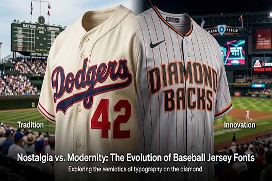
The Detroit Tigers trap themselves in an entirely different kind of historical cycle. Historians track over thirty separate micro-evolutions of their Old English ‘D’ over the last century (yes, some academic out there actually gets paid grant money to document millimeter shifts in a gothic letterform; we can all envy that job security). That ornate, gothic letterform is so heavily tied to the gritty, industrial reality of the Motor City that changing it would likely trigger a riot. Cursive scripts offer a completely different psychological trigger. The Los Angeles Dodgers rely on a mid-century aesthetic, utilizing a sweeping underline tail that implies smooth, effortless motion. The St. Louis Cardinals take it a step further by integrating their classic cursive script directly with an embroidered illustration of two birds perched on a yellow bat. That artisanal narrative creates a traditional value that modern digital fonts simply cannot replicate.
Shrinkflation Hits the Locker Room
The romance of heavy tackle twill recently slammed headfirst into a wall of corporate cost-cutting. For decades, players wore thick, zig-zag stitched letters that cast actual physical shadows on the jersey fabric. That tactile texture signaled premium, field-grade craftsmanship. Nike and Fanatics tried to kill that standard with the 2024 Vapor Premier uniform rollout. The corporate goal was athletic optimization through lighter, stretchier, highly breathable fabrics. The execution was a catastrophic misfire. To shave off a few ounces of weight, the manufacturers shrank the player names on the back of the jerseys into tiny, tightly arched digital blurs. Heavy embroidered sleeve patches were swapped for flat, lifeless heat-pressed stickers.
Players absolutely hated the gear. Trea Turner openly trashed the new designs to the press, and other clubhouse veterans compared the garments to cheap knockoffs from a discount rack. Transparent uniform pants went viral for all the wrong reasons. The reality is that you cannot impose sterile, lightweight minimalism on a sport built entirely on physical tradition. When designers remove the tactile weight of authentic tackle twill, they strip the typography of its intrinsic authority. The MLBPA actively revolted against the aesthetic downgrade. That intense pushback forced a league-wide mandate to restore larger typography, fully embroidered patches, and heavier fabric specifications by the 2025 and 2026 seasons.
The Sublimated Identity Crisis
While the primary home and away uniforms retreat to the safety of traditional tailoring, the league uses the City Connect program to beta-test hyper-modern typography. The 2026 wave of these alternate uniforms relies heavily on dye-sublimation. Flat ink infused directly into the fabric allows designers to execute complex gradient meshes and hyper-localized cultural slang. The Milwaukee Brewers slapped a sunset-toned “Wisco” across the chest to court intimate regional loyalty. The Pittsburgh Pirates turned their custom font into a literal structural replica of the city’s steel suspension bridges.
San Diego abandoned their classic typography altogether, running with a vibrant sunset-ombre fade to honor bi-national Mexican folk art traditions. The Texas Rangers backed up a modern “Tejas” script with intricate mariachi-inspired fill patterns. This experimental aesthetic works precisely because contemporary visual techniques elevate a specific cultural narrative. Front offices are not just erasing the past; they are using modern graphics to tell a highly targeted local story.
Boardroom Hijacking: Renting the Sleeve Space
Step out of the clubhouse and walk straight into the executive suites of team owners if you want to understand the actual existential threat to visual tradition. The real disruption isn’t performance fabric; it is the ruthless monetization of a four-by-four inch slice of real estate. When teams sell prime sleeve space for corporate sponsor patches, they fundamentally destroy the historic symmetry of the jersey. A few front offices fight tooth and nail to protect their brand equity from this commercial invasion. The St. Louis Cardinals forced financial firm Stifel to render their corporate logo in the team’s signature red. The Padres strong-armed Motorola into utilizing a custom brown and gold palette to match the historic uniform colors.
Frankly, the ugliest reality of this corporate cash grab revolves entirely around television broadcast mechanics. Equipment managers literally swap which sleeve holds the sponsor patch based on a player’s batting stance so the corporate logo always faces the primary centerfield camera. Switch hitters need two completely different jerseys ready in the dugout just to ensure the corporate overlords get their screen time on every at-bat.
The True Cost of the Thread
Let’s dispense with the idea that baseball typography is just superficial graphic design. The letters stitched onto these backs represent the most durable currency in the sport. Every time a manufacturer tries to shave an ounce of weight or a front office slaps a neon gradient where a classic serif belongs, they gamble with generational loyalty. Fans do not want sterile innovation at the expense of permanence. The visual identity of a baseball team is one of the few remaining civic anchors in an increasingly fragmented digital world. The survival of the traditional baseball font—heavy, shadowed, and fiercely protected—proves that some aesthetic fortresses are simply too profitable to tear down.