
Vogue Font Style Guide and Design Influence
Vogue font has become one of the most recognizable type styles in fashion publishing. When people think about high fashion magazines, they often picture tall, elegant letters spaced with confidence across a glossy cover. The visual identity tied to this typography carries authority, refinement, and timeless beauty. It is more than just a set of letters. It represents a design philosophy rooted in balance, contrast, and sophistication. In this article, we will look at how this iconic style developed, why it feels so powerful, and how designers use similar serif fonts to achieve that classic editorial look.
The Origin and Identity of Vogue Font
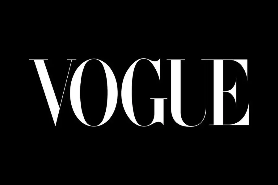
The typography associated with Vogue magazine is rooted in high contrast serif design. It is widely linked to the Didone style, a category of typefaces known for dramatic thick and thin strokes. These fonts often feature sharp serifs, vertical stress, and refined curves. The masthead that defines Vogue has evolved slightly over the decades, yet it has always maintained a bold and elegant presence.
The original logo design dates back to the late nineteenth century when the magazine first launched. Over time, the lettering was refined to appear more modern while keeping its classic foundation. The letters are evenly spaced and perfectly proportioned. The symmetry creates a sense of authority. The simplicity ensures that the typography itself becomes the statement.
This style communicates luxury without decoration. There are no extra flourishes. Instead, the power lies in precision. The tall letterforms and thin hairlines create contrast that draws the eye instantly. It feels both traditional and contemporary at the same time.
Key Characteristics of the Typeface Style
The Vogue font style is typically associated with serif typefaces similar to Bodoni or Didot. These fonts share common visual features that make them feel upscale and editorial.
First, there is high contrast between thick and thin strokes. Vertical lines are strong and bold, while horizontal strokes are delicate and refined. This contrast gives the letters drama and elegance.
Second, the serifs are sharp and clean. They are not rounded or heavy. Instead, they are crisp and intentional. This sharpness adds sophistication.
Third, the spacing is generous. The letters often have noticeable kerning that allows each character to breathe. This spacing enhances readability and contributes to a premium feel.
Finally, the structure is geometric yet graceful. Circles are smooth. Lines are straight. Everything feels balanced. The result is a timeless design language that still works in modern layouts.
Designers who want a similar effect often turn to Didot, Bodoni, or other modern serif fonts. These alternatives capture the same essence while being accessible for branding and digital use.
Read More: Verdana Font – A Clear Choice for Screen Design
Why It Represents Luxury and Authority
Typography plays a psychological role in branding. The Vogue font style feels luxurious because of its contrast and precision. High contrast typefaces naturally attract attention. They feel formal and carefully crafted.
Luxury brands often choose serif fonts because they suggest heritage and tradition. A serif typeface can signal that a brand has history and credibility. When combined with minimalist layouts, the effect becomes even stronger.
The consistent use of this style across magazine covers has reinforced its association with fashion leadership. Readers connect the typography with cutting edge style, celebrity culture, and artistic photography. Over decades, this visual consistency built trust.
There is also a sense of exclusivity. The tall letterforms and refined spacing create a feeling of distance and sophistication. It does not feel casual. It feels intentional and curated.
This is why many high end brands in beauty, jewelry, and couture fashion adopt similar fonts. They want to borrow that same sense of refinement and prestige.
Using a Similar Style in Modern Design
Designers today often look for ways to recreate the Vogue font aesthetic in their own projects. While the exact proprietary logo design may not be publicly available, similar typefaces can achieve the same mood.
When choosing a serif font, look for strong vertical lines and thin hairline strokes. Avoid overly decorative scripts. Keep the design clean and minimal.
Pairing the typeface with generous white space is essential. The elegance of the lettering depends on breathing room. Crowded layouts weaken the effect.
Color also plays a role. Black and white combinations enhance contrast and keep the focus on typography. Soft neutral tones can maintain a luxury feel without overpowering the letters.
In digital design, pay attention to screen readability. High contrast fonts can lose clarity at very small sizes. Adjust weight and spacing to maintain balance.
For branding projects, test the font across different materials. Print, social media, packaging, and website headers should all feel consistent. The goal is to create a unified identity that echoes the timeless editorial style.
The Cultural Impact of Editorial Typography
The influence of Vogue font style extends beyond magazine covers. It has shaped how people perceive fashion media and luxury branding around the world.
When a single masthead becomes iconic, it sets a standard for competitors. Other fashion publications adopted similar serif styles to project elegance. This created a visual language for the entire industry.
The impact also reaches into pop culture. Fashion inspired posters, event invitations, and beauty campaigns often mimic this typography. Even small independent designers use similar fonts to elevate their brand image.
Typography is often overlooked, yet it silently shapes perception. The success of this style proves how powerful letterforms can be. A carefully chosen typeface can define an era.
Over time, trends in graphic design shift toward minimalism and then toward bold experimentation. Yet the classic high contrast serif continues to return. Its timeless structure makes it resistant to passing fads.
The endurance of this aesthetic shows that strong design fundamentals never lose value. Balance, contrast, and clarity remain central to effective visual communication.
Final Thought
Vogue font is more than a recognizable masthead. It represents a tradition of elegance and visual authority that has influenced fashion publishing for generations. Its high contrast strokes, sharp serifs, and confident spacing create a lasting impression that feels both refined and modern. Designers who study this style can learn valuable lessons about balance, simplicity, and brand identity. Whether used in print or digital form, the essence of this typography continues to shape how luxury and sophistication are expressed through design.
FAQs
What type of font is Vogue font?
Vogue font is associated with a high contrast serif style similar to Didot or Bodoni.
Is the Vogue font free to use?
The official logo design is proprietary, but similar serif fonts are available for commercial and personal use depending on their license.
Why does Vogue font look elegant?
It looks elegant because of its strong vertical lines, thin hairline strokes, sharp serifs, and balanced spacing.
Can I use a similar font for my brand?
Yes, many designers use Didone style serif fonts to create a sophisticated and editorial brand identity.
Does Vogue font work well for websites?
It can work well for headings and large text on websites, but designers should ensure readability at smaller sizes.
What makes high contrast serif fonts popular in fashion?
High contrast serif fonts feel refined and timeless, which aligns perfectly with the image of luxury fashion brands.