
Punk Font Styles – Bold Type for Rebellious Design
Punk font was the visual cry against the commonplace always. It was born out of the underground music scenes and anarchic youth culture and has the underground energy, DIY spirit, and unapologetic character. This rough lettering style catches the eye in a second, whether sprayed on the cover of a concert poster, sewed on a band T-shirt, or included in an otherwise-modern brand identity.
In contrast to the refined corporate typeface, punk-inspired typography tends to appear as either handcut, tattered or disorganized or viciously proud. It breaks rules on purpose. This is precisely the reason why designers, musicians, and creatives are still attracted to it. This guide is going to explore its background, features, design variations, applications in real-life projects, and tricks that can be used to ensure it is effective in contemporary projects.
The Origins of Punk Typography
Punk typography originated in the 1970s punk rock in the United Kingdom and the United States. Groups such as The Sex Pistols and The Clash not only questioned the conventional rules of music, but they also shook the visual culture. Several covers of albums, flyers of gigs, and zines were designed with the poor means and thus used cut-and-paste method of lettering, ransom-note manner, and messy layouts.
The role was significant in DIY culture. Scissors, glue, typewriters and photocopiers allowed designers and fans to create bold images at very low costs and in limited time. It was not a bad appearance but the declaration. The harsh textures, incongruent letters, violent make-up were cries of frustration, insurrection and anti-establishment.
With time, this style turned out to be iconic. What began as a subterranean form of opposition became a typographic style that has continued to shape design even to date.
Key Characteristics of a Punk Font
Though it is not exactly defined, the majority of the punk-inspired typefaces have several common features.
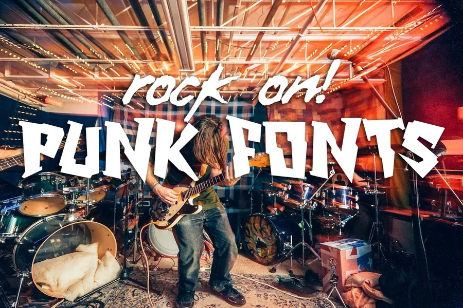
To start with, they usually look discomposed or broken. Letters can be scratched, tearing, splattered or eroded. This is a crude texture that brings emotion. Second, anomaly prevails. There may be no perfect character match. There can also be oversized letters, compressed letters, or tilted letters. This brings visual tension/ unpredictability.
Third, boldness dominates. Impact is commonly reinforced with thick strokes, heavy weights as well as high contrast. Fourth, typography in the style of collage is a staple. Ransom-letter effects, when all the characters appear to be cut out of another piece, is a classical punk style. Lastly, one has to be a very strong attitude. The writing, be it in hand, stencil or graffiti-inspired, should be expressive and not neutral.
All these characteristics together produce the effect of loud, urgent, and unapologetic typography.
Read More: Wanted Font Style Guide for Bold Creative Projects
Why Designers Still Use Punk Font Today
Although this rebellious style of lettering was produced decades ago, it has remained to this day.
It is occasionally used by modern brands to create some sense of authenticity and advantage. It is used to mark aggressive identity by streetwear brands, music festivals, and rogue creators. Inspired by grunge typography, even mainstream campaigns sometimes feature such typography to ensure a perceived appearance of gritty and relatability.
Punk aesthetics are in opposition to down-to-the-barebones interfaces in the digital design. Such contrast can be effective. It is very powerful in creating visual hierarchy and emotion when it is used consciously.
It appeals also to those audiences who appreciate individuality and counterculture. Typeface is tolerantly human in a world of smooth images where lines are flawless.
Best Practices for Using Punk Typography
Although the style does well with breaking rules, consideration also does not go to waste.
To begin with, it is essential to focus on readability. In extreme cases, too chaotic lettering may be hard to read. In case of the loss of the message, the design fails. Balance edge with clarity.
Second, use it strategically. It is very visual and therefore best when it comes to headlines or logos and short phrases. Do not use it on long paragraphs or body texts. Third, pair it wisely. The contrast between rebellious headline font and simple sans-serif as the supporting text can be quite impressive without causing excessive load on the layout.
Fourth, consider context. A dirty concert poster would fit in this style perfectly but a corporate financial report does not. Ensure that the tone is in keeping with the project purpose. Lastly, do not go overboard on effects. Excessive splatters, distortions or textures may be insincere. Mild discomfort has a more effective effect than dramatic fashioning at times.
Creating Your Own Punk-Style Lettering
You also may experience a really authentic feel when you come up with your own lettering rather than simply use ready-made typeface.
Begin with sketches made by hand. Create crude forms with markers, brushes or even torn paper. Have the results scanned or photographed, and digitize them. Test layers of textures. To enhance the DIY feel, add noise, scratches, photocopy effects or torn edges.
The combination of various fonts can also be done deliberately. Turn characters sideways, alter sizes or a bit, to bring a dynamic tension. Most importantly, learn to accept flaws. The beauty in this style is that it is not tidy and contained.
Common Mistakes to Avoid
Rebellious typography has been abused by designers with the effect of diluting its effect.
Among the errors made includes complicating the layout. Nothing is remarkable when all is screaming. Allow the typography to rule instead of having excessive graphic elements. Other problems include fake implementation. Making a brand name with violent writing technique to advertise a brand of relaxation and wellness will be out of place and puzzling.
Lastly, bad spacing may spoil the great typeface. Since most punk-inspired fonts are irregular, it is necessary to use a fine control over tracking and line spacing. The rawness can be made potent when it is well addressed, as opposed to being chaotic.
Final Thought
Punk font is not merely a type of lettering, it is an attitude, rebellion, and expression. Its origins in underground culture provide it with an emotional quality which refined typography can often lack. It can add a touch of flair and influence to your designs, be it music, fashion, digital media or bold branding, this expressive style can make your designs sound, look, feel and taste.
The key is balance. Make purposeful use of the raw energy, honor readability, and couple tone to your message. Rebellious typography is not a mere embellishment to a design, when done correctly, it constitutes it.
FAQs
What is a punk font?
A punk font is a rebellious, distressed, or chaotic style of typography inspired by punk rock culture and DIY design aesthetics from the 1970s and beyond.
Where is punk-style typography commonly used?
It is often used in music posters, album covers, streetwear branding, alternative magazines, and bold digital graphics.
Can I use punk fonts for professional branding?
Yes, but only if the brand identity aligns with a bold, edgy, or unconventional personality.
Are punk fonts readable for long text?
No, they are best suited for headlines, logos, and short impactful phrases rather than long paragraphs.
How can I make my own punk-style lettering?
You can create it by hand-drawing letters, adding distressed textures, mixing typefaces, and embracing intentional imperfections.
Do punk-inspired fonts work in modern web design?
Yes, when used sparingly for headings or accents, they can add personality and contrast to clean layouts.