
One Piece font Style Guide for Fans and Designers
One Piece font goes beyond being a type of lettering. It portrays the daring vitality, adventure and the spirit of piracy of the iconic manga and anime show One Piece. This distinctive typography contributes to the identity of the franchise as evidenced by the dramatic logo on the cover down to fan-made posters and merchandise. For fans, it feels iconic. It also presents a delightful and expressive style to the designers.
This guide will teach you what is special about this font, its source, how it is applied, and you can apply similar styles to your own creative projects without going overboard in doing it.
The Origins Behind the One Piece Font
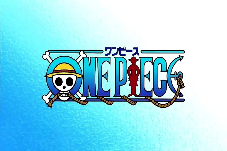
Letting style that went hand in hand with the series was made to suit its adventurous theme of pirates. The logo is a combination of large letters in serif-style, and mischievous curves and lines. It also encompasses visual characteristics such as skull with a straw hat and other details of rope are woven in the typography.
This composition has a reflection of the world of pirates, treasure hunts and ocean voyages. The writing is a bit coarse and yet legible. That balance is important. It makes the logo more of a character but not difficult to comprehend.
Its original logo was designed towards the manga. However, with time, fans started to recreate the appearance with the help of the same fonts. Since the official typeface is sign-on, it does not have an actual public version. Rather, designers opt to use inspired substitutes that are almost similar to the initial style.
The strength of the font has increased because the series turned into one of the most successful manga franchises in the world. The logo is easily identifiable even when it is not being viewed by the regular viewers.
Key Design Features and Style Elements
In order to guess what is so attractive about this typography, it is better to decompose its key characteristics.
To begin with, the letters are bold and strong. Their strokes are thick leaving a strong and assertive appearance. This is congruent with the brave nature of the protagonists.
Second, the typeface includes ornamental serif. These little extensions of the letters make it somehow old-fashioned maritime. It alludes to the maps of pirates, ancient ships, and classic adventure tales.
Third, it is narrow spacing, but controlled. The letters are unified and this brings oneness in the logo. Elements of the design (rope, symbols) are often incorporated into the text in most versions.
Balance is another valuable characteristic. Although the font appears to be fun and theatrical, it is still readable far. That is among the main lessons of designers. Clarity should not be compromised in a good theme.
Color also plays a major role. Bright blues, reds and gold are common in the official logo. These colors help to make the text more vivid on various backgrounds and contribute to the adventurous atmosphere.
Popular Alternatives and Similar Fonts
Since the official text is handmade, the fans tend to find some similar fonts that would convey the same vibe. There are numerous versions of it, which are inspired online. Such fonts tend to emulate the heavy serif design and the elements of style representing pirates.
In selecting such a style, seek the following:
Strong, thick strokes.
Slightly curved serifs.
Good-natured, yet burly look.
Large font readability.
There are also designers who modify the available serif fonts, so that they can resemble the original appearance. They are allowed to manipulate the edges, provide texture or even include minor graphics like ropes or anchors.
One should keep in mind that the same logo should not be used as a commercial one as it can be copied, and the copyright will be violated. Inspired fonts are usually safer in personal fan art or other non-commercial work. In case you intend to sell the merchandise or even brand something using the design, you need to come up with your own version instead of using the original logo.
How Designers Use the One Piece Font Style
This typography has a much stronger impact, than the manga covers. The same styles are applicable in different artistic works by designers.
Fan posters are usually done with large pirate style writing to get the adventure theme. The themed content designed by social media graphics implies the use of inspired fonts to celebrate birthdays, events, or anime watch parties.
Another trendy sector is merchandise. T-shirts, hoodies, stickers, and phone cases are also often the text based on the well-known logo style. The bold appearance is effective on cloth and print materials since one can see it even when it is far.
Similar fonts are also used by the graphic designers in gamer content, YouTube thumbnails and streaming banners. The drama style immediately draws attention and this is useful in the online world where it is extremely competitive with regard to clicks.
The similar typography is frequently used in the pirate-related events and parties with children even beyond the anime world. The adventurous nature makes it appropriate in treasure hunt games, invitations and theme decorations.
The key is moderation. This style is bold and detailed making it the best font to use as a headline. It does not suit lengthy paragraphs or body text. It makes good use of short titles in order to maintain the design clear and effective.
Read More: Folklore Font Style Guide For Creative Storytelling Design
Tips for Using Pirate-Style Fonts Effectively
When you are inclined to work with a design based on One Piece font inspirational, some practical tips are to be followed.
Keep readability first. It is always good to test your text at varying sizes. A font can appear fine in a big screen but become illogible in a small font.
Pair it with simple fonts. Bold pirate heading is effective with the body of text in clean sans serif font. This contrast enhances equilibrium.
Use color carefully. The text can be highlighted in brightly colored blues and reds. But one may get overloaded with colors and therefore make the design look untidy. Select two or three key colors and remain loyal.
Add texture lightly. Other designers may incorporate an aged or worn out touch to sharpen the theme of pirates. This will work well, however excess texture will decrease clarity.
Think about context. An adventure theme, fantasy projects, and bold branding all match a pirate-inspired font well. It does not fit in formal or corporate designs. Always ensure that you select a font that fits the message that you are trying to convey.
These principles will allow you to be inspired by the legend and still make your work professional and refined.
Cultural Impact of the One Piece Font
Typography can be seen to influence our recollection of a brand or a tale. The logo has come to be associated with adventure and loyalty in this instance. It is identified immediately by the fans on merchandise, posters, and even tattoos.
The font adds to the emotion that people have towards the series. When a person looks at that used type of lettering, it reminds him or her of great adventures, friendship, and sea-travel.
This demonstrates the strength of typography. It is not just about letters. It is about identity. The correct font might convey power, attitude, and character prior to the reading of a single word.
This is a valuable lesson to future designers. An effective logo and font style has the potential of becoming classic. It is able to develop around a tale and be useful over a lifetime.
Final Thought
The One Piece font is a lot more than a decorative text. It takes the adventurous heart of a world of pirates, dreams and infinite horizons. It is a powerful example of design with its bold structure, playful details, and good readability.
No matter whether you are a fan who wants to create some personal artwork or a designer who has to be inspired, you can learn proper lessons concerning branding and visual identity by studying this iconic style. Concentrate on balance, lucidity, and theme. When all these elements combine a font is memorable.
FAQs
What is the official One Piece font called?
The official logo uses a custom-designed typeface created specifically for the series, and there is no publicly released exact version.
Can I download the real One Piece font for free?
The original font is not officially available for public download, but many inspired alternatives exist online for personal use.
Is it legal to use a One Piece inspired font on merchandise?
Using an exact copy of the official logo for commercial products can cause copyright issues, so it is safer to create a unique inspired design.
What type of font style is similar to the One Piece logo?
Bold serif fonts with decorative and slightly rugged details are the closest match to the original logo style.
Can I use a pirate-style font for professional design projects?
Yes, but it works best for themed or creative projects rather than formal or corporate branding.