
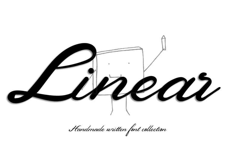
Linear Font Design Guide for Modern Typography
Linear font has gained popularity in the contemporary design due to its clean lines and proportional look. This style may be used when communicating in branding, websites, posters, or mobile apps and conveys the feeling of clarity and confidence. It is appreciated by designers because of its simplicity and flexibility in both digital and print versions. In this guide, you will understand what makes this typeface style, why it is so effective, and how you can use it to make your design effective without making it too complicated.
What Is a Linear Font?
A linear font is a typeface style that is constructed on a basis of clean lines and low decorations. The lines tend to be, either straight or curvy, and the thickness of each character remains uniform. This style is not ornamental or script typeface as it is structured oriented.
The majority of the linear typefaces are classified as a wider term of the sans serif typeface. They do not use little finishing lines at the end of the letters, but use pure geometric or humanist figures. It is due to this fact that they look contemporary and simple to read.
This design is attractive in that it is direct. It does not attempt to affect us with flourishes. Rather it speaks through its actions. This is why numerous technological brands, startups, and editorial designs are based on this strategy. It is neutral and strong at the same time.
Key Characteristics of Linear Typeface Styles
Stroke consistency is the characteristic of the linear typeface. The depth of every line is usually constant at both sides. This brings about a balance and order.
Geometric clarity is the other significant feature. The letters are frequently founded upon basic figures that include circles, squares, and triangles. This renders the alphabet to appear systematic and balanced. There is a touch of humanity in its variations, curves are less artificial and more natural. Nevertheless, the overall appearance is clean even then.
Space is also highly important. Linear styles tend to have extensive letter spacing in order to be readable. This works particularly in the digital space whereby text should be readable on different screen dimensions.
Due to these features, this font type can be used in headlines, logos, and in the body. It is easy to adapt bold, regular as well as light weight without losing its identity.
Why Designers Choose Linear Fonts
Designers usually resort to this style as it provides instant visual clarity. Trust is created through clarity in branding. Professionalism and stability are implied by a clean typeface. It does not lose focus of the message.
The other cause is versatility. This is because a linear design could look either simple and classy in a given scenario and loud and vibrant in another. Designers are able to modify moods by changing the weight and space without changing the type family.
This style also works well in the digital platform. Readability is necessary on websites and mobile applications. The letterforms are simple and well balanced hence one can read material with ease over a long duration.
The timeless quality is also to be taken into consideration. As decorative fonts can be trendy and disappear soon, simple lines based typefaces are likely to remain topical. They are not attached to a given period of time and hence they are a safe long term decision in brand identities.
Read More: Verdana Font – A Clear Choice for Screen Design
Using Linear Fonts in Modern Design
In your project using a linear font you want to use, you need to start with a purpose. When you desire a smooth and modern appearance, you should select a geometric one. A more warm and friendly version would be a humanist version, however.
Hierarchy is important. Headings should have heavier weights whereas those of the body should be lighter. This is contrast but does not involve using a totally different font. The style is clean and therefore it combines well with bold images and images that are strong in layout.
This is a good typeface in branding where it is used in logos. It is simple and that is why it can be scaled to business cards up to billboards. Even small sizes have clean strokes.
In the case of editorial layouts, maintain a balance between line length and spacing. Although these fonts are user-friendly to read, excessive text cluttering may lower readability. Keep the spacing between paragraphs and headings.
Pairing also matters. Contrast may be made by combining a serif font with a linear style. The formal plainness of one is the elaboration of the other. The method is prevalent in magazines and portfolio websites.
The perception is also affected by color choice. The font is classy and sophisticated when combined with neutral colors. It can be lively and dynamic, when it is mixed with bright colors. The letterforms may be used to create quite different moods depending on the general system of design.
Common Mistakes to Avoid
Despite the versatility of this style, there are a few errors which the designers commit. It is making an assumption that all linear typefaces are the same. Minor variations of the letter forms, spacing, and proportions can alter the general feel radically. It is always best to test the font in actual layout conditions before you finalize a design.
Excessive use of ultra thin weights is also another error. Light strokes can be stylish in big headings but when used in small fonts or on low resolution screens become illegible. Striking a balance between beauty and functionality.
Another problem is poor spacing. Since these fonts are based on clean lines, any irregular kerning or narrow line spacing is more prominent. Slow down and fine-tune tracking and leading to best readability.
Visual identity may also be weakened when a lot of variations are used in a similar project. Use few weights and fashions so that there is consistency. The beauty of this design method is simplicity and thus, do not be too complex.
Lastly, do not forget that little need not be dull. Layout, color and composition can still be used to create personality. Your message should be backed up by the typeface as opposed to it taking centre stage.
Final Thought
Modern typography is still being influenced by linear font styles due to their ability to provide an element of clarity and flexibility. They are apt to be used both in digital and print contexts since their strokes are balanced and their forms are simple. They offer a platform that is up to date and classic at the same time in branding, editorial design, etc.
The selection of the appropriate typeface is not just a matter of aesthetics. It is about communication. The use of a clean and organized font can highlight your message without being distracting. This style can take your whole system of design to the next level when applied in the right sense.
With the changes in trends, the need to be clear has never diminished. This is why such a typography direction will probably stay one of the pillars of the visual communication in the next few years.
FAQs
What is a linear font in simple terms?
A linear font is a typeface style with clean and consistent strokes, usually without decorative elements, designed for clarity and modern appeal.
Is a linear font the same as a sans serif font?
Most linear fonts fall under the sans serif category, but the term specifically highlights the clean line structure and minimal stroke variation.
Where are linear fonts commonly used?
They are widely used in branding, websites, mobile apps, advertising, and editorial design because of their readability and modern look.
Are linear fonts good for body text?
Yes, many linear typefaces work very well for body text due to their clear letterforms and balanced spacing.
How do I choose the right linear font for my project?
Consider your brand personality, the medium where it will appear, readability needs, and how the font pairs with other design elements before making a decision.