
License Plate Font Guide – Styles, Rules, and Uses
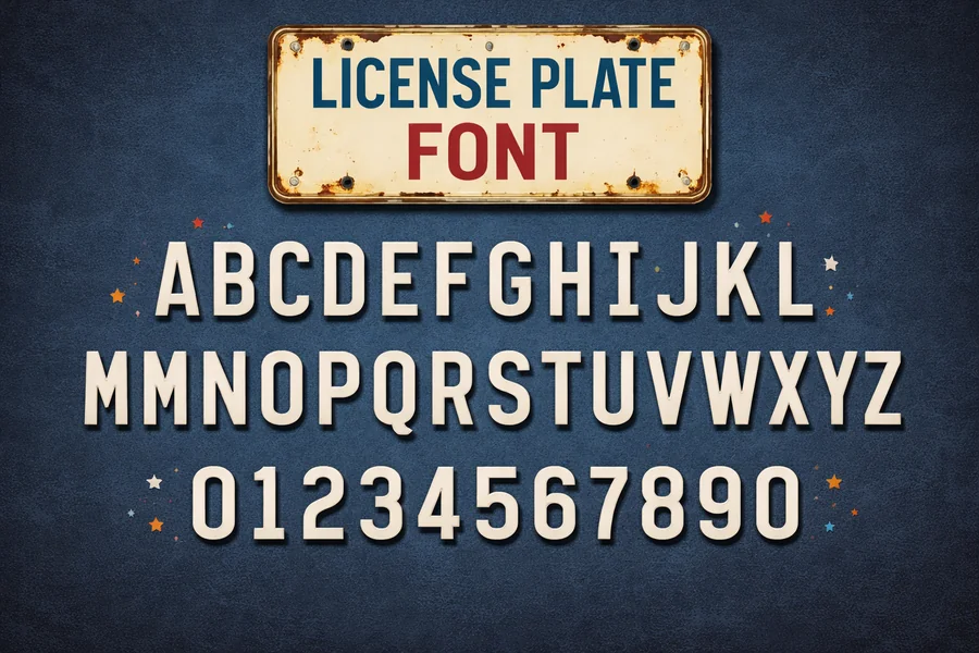
The License Plate font styles are created keeping in mind one thing, and that is the readability, which is easily apparent and quick to see. The characters on a plate should be easily recognizable regardless of the speed of the vehicle that is in motion or when the vehicle is parked in very dim or dark environment. This is what has influenced the design of these fonts so that they are not unique as typography is.
These fonts are usually heavy, spaced uniformly and arranged in a manner that avoids confusion in identities of similar characters such as the letters O and 0 or B and 8. The government and transport authorities are keen on the typefaces used in license plates to make sure that the people in charge of the law enforcement in the streets, the tolling machines and even the human eyes can read the typeface correctly.
Except in vehicles, the visual syntax of these fonts has found popularity in the fields of graphic design, branding and digital typography. The fonts inspired by license plates are applied to multiple projects by many designers in case of the necessity to obtain the bold, industrial, or official appearance.
What Is a License Plate Font?
A vehicle registration plate is a special font typeface that is used to print vehicle registration plates. These typefaces are not aimed at the appearance, but directed at readability, uniformity, and safety, unlike decorative fonts.
These fonts are developed by transportation authorities to minimize misreading. Indicatively, there are character changes as slight adjustments to prevent confusion. The digit one can have a small base or serif-like form in it, whereas the digit zero can have a more oval form to distinctly separate it visually with the letter O.
Most nations produce their own plate font and the others follow the standardized design. An example is Germany where the FE-Schrift font has been designed to avoid vandalism and enhance readability. In the United Kingdom, the font in use is the Charles Wright font that has widely been used on the British plates since the 1930s.
The fonts of the license plates can be very clean, geometric and balanced due to their practical design.
Key Characteristics of License Plate Fonts
Types of license plates have a number of similar characteristics that contribute to their effectiveness in the field.
High legibility is one of the most crucial features. Characters should be legible to the viewer even when they are looking at the screen, or are under the surveillance cameras. This is the reason why a majority of plate fonts do not use excessively ornamental materials.
Uniform spacing is another characteristic. The letters and numbers are placed equally apart so that the recognition systems can identify them properly. This uniform spacing is important to the automatic number plate recognition (ANPR) technology.
Design durability is also essential. As the plates are frequently exposed to dirt, rain and damage, font should not be easily spoiled, and should be easily read even when a bit of a character is covered.
Lastly, anti-tampering design features are present in a large number of license plate fonts. Other fonts are designed in such a way that it becomes hard to alter one letter to be another one. This will avoid frauds and identity frauds.
Read More: Tahoma Font Guide – History, Features and Uses
Popular License Plate Fonts Around the World
Various nations adopt different fonts on registration plate which reflects the need as well as the national standards.
FE-Schrift is one of the most famous fonts, which is used in Germany and various European states. This font has been created in order to minimize forgery and enhance automated reading systems. Its uncharacteristic shapes complicate the modification of its characters.
In the United Kingdom, the font is the Charles Wright font which has become a legend in the designing of vehicles. It has strong space between the characters that are clean and bold.
The fonts of the license plates differ in the United States. There are those using block-style fonts, others have customized designs that are in tandem with the branding of the state.
Australia is also a country that has various plate fonts used based on the region and plate style; however, most are based on the same readability rules.
Regardless of these variations, every license plate font is more focused on the readability and functionality than on the decoration.
Why Readability Matters in License Plate Design
A vehicle plate is mostly used to identify. Police, turn-takes, parking machines, and security news cameras use clear typography to read the plate numbers fast.
When the font is too complicated, the automated recognition systems can read wrong characters. Any minor mistake may make the difference between the wrongful fines, not identified, or being confused with the law.
Designers, therefore, make sure that every character has high contrast and shape difference. As an example, the letter S cannot look like the number 5, and the letter Z cannot be confused with the letter 2.
Design is also affected by lighting conditions. Plates should be legible during headlights, at night or during bad weather. This is made possible, by the use of reflective materials and bold fonts.
Rules in most countries have specifications as to the dimensions, thickness and distance between characters on a license plate to ensure uniform legibility.
Uses of License Plate Fonts Beyond Vehicles
Designed to identify vehicles, these fonts have made their way into the contemporary design and branding even though they were initially produced by automotive companies.
The fonts of the posters, merchandise, or car-related branding are often created as license plate fonts. Designs have an authority and practical appearance due to their bold and structured appearance.
These fonts are also used in some video games and films to form realistic car plates or give user interfaces a sense of law enforcement.
Moreover, there are numerous fonts, which replicate license plates, and they are found in digital font libraries. The fonts enable designers to attain the unique appearance of actual plates that are not limited to exclusive official fonts.
The simplicity and straightforwardness of these fonts can also be used in signage and industrial design.
Final Thought
On the one hand, it is possible to believe that license plate fonts seem to be quite straightforward and not terribly thought-out, however, they are actually planned and regulated. All the curves, lines, and space decisions have a role in ensuring that the characters can be read even in less favorable circumstances.
These fonts show that typography can perform a practical role in addition to establishing a familiar visual representation. Since government regulation plates to graphic design project, license plate-style typography still comes into play in the way we display numbers and letters in the street.
With the better recognition systems and technological advancement, it is most likely that the design of these fonts will keep on changing to accommodate security, readability and efficiency.
FAQs
What is a license plate font?
A license plate font is a specially designed typeface used on vehicle registration plates to ensure maximum readability and prevent character confusion.
Why are license plate fonts different from normal fonts?
They are designed for visibility, accuracy, and security so that both humans and automated systems can read plate numbers quickly and correctly.
Which font is commonly used for license plates?
Different countries use different fonts, but examples include FE-Schrift in Germany and Charles Wright in the United Kingdom.
Can license plate fonts be used in graphic design?
Yes, many designers use license plate-style fonts for branding, posters, and automotive-themed projects because of their bold and clean appearance.
Are license plate fonts standardized worldwide?
No, each country or region may use its own design and regulations, although most follow similar readability principles.