
How Brand Design Shapes Buying Decisions – The Visual Language of Vape Ireland
Stand in front of any vape shop's shelf, or scroll through an online catalogue, and the packaging does most of the persuading before you've read a single ingredient. Bold sans-serif logotypes, saturated gradients, minimalist device casings that look more like tech accessories than nicotine products: the visual identity of the vape Ireland market has developed its own distinct language over the past several years, and it's worth taking seriously as a design story, not just a retail one.
Typography had to solve an unusual problem
Vape packaging design faces a constraint most consumer product categories don't: heavy regulatory text requirements sitting alongside a need to look distinct on a crowded shelf or product grid. Health warnings, nicotine content, and age restriction notices take up meaningful space on every label, which means the brand name and flavour name have to do a lot of visual work in whatever space remains.
This has pushed many vape ireland and e-liquid brands toward condensed, bold sans-serif typefaces, letterforms that stay legible even when squeezed into a narrow label band. You'll notice a lot of tight letter-spacing and heavier weights than you'd typically see in, say, food or drink branding, precisely because the type needs to hold its own against a lot of competing regulatory text on the same surface.
Colour coding became a functional necessity, not just an aesthetic choice
Anyone who's browsed an e-liquid range knows the pattern instinctively even if they've never thought about why it exists: menthol and mint flavours lean toward cool blues and greens, fruit flavours use warm, saturated tones matched loosely to the actual fruit, and tobacco flavours stick to browns, ambers, and muted golds. This isn't accidental. With dozens of flavour variants often sold under a single brand umbrella, colour becomes the fastest way for a shopper to navigate a range without reading every label individually.
This matters even more in an online vape shop context, where a customer might be scanning a grid of forty thumbnail images rather than physically picking bottles off a shelf. Consistent colour logic across a brand's full range makes that scanning process noticeably faster, and brands that get this right tend to see it reflected in how quickly customers find what they're looking for.
Device design has borrowed heavily from consumer tech, deliberately
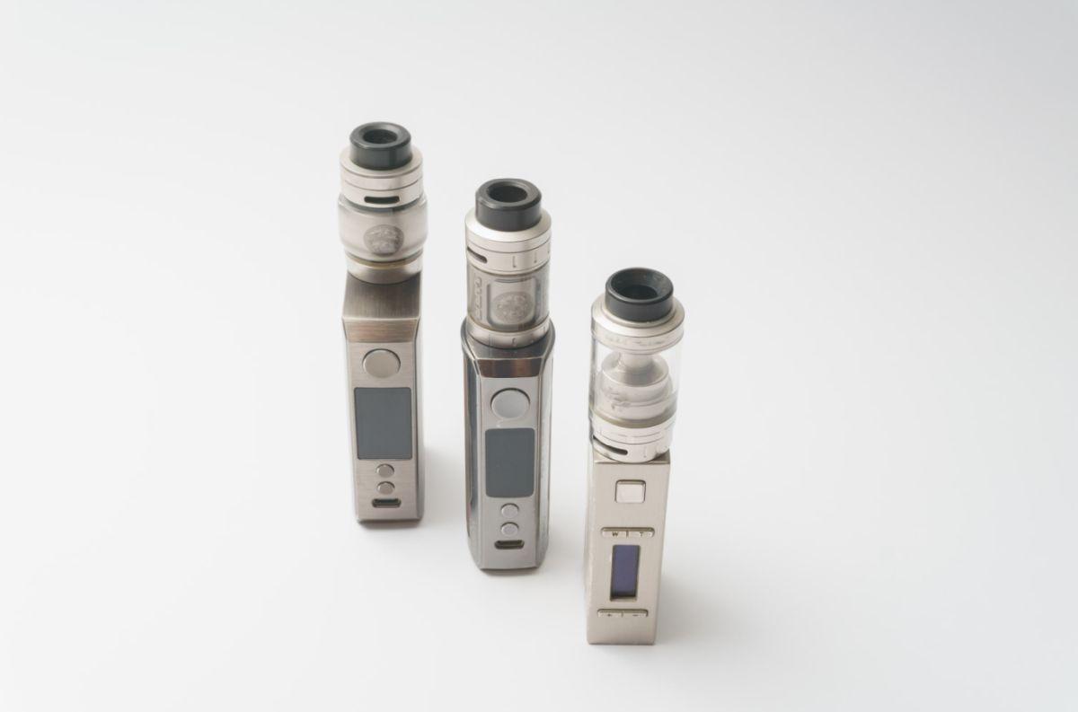
Compare an e-cigarette from a decade ago to a modern pod kit and the shift is obvious: matte finishes, rounded edges, single-button interfaces, and a general visual restraint that looks a lot more like an AirPods case or a premium phone accessory than the cigarette-mimicking devices that defined the category's early years. This is a deliberate positioning choice. Manufacturers understand that visually distancing their devices from cigarettes helps the product read as its own category rather than a cigarette substitute, which matters both for regulatory perception and for how comfortable people feel using the product in public.
Brands like VooPoo and Aspire have leaned particularly hard into this minimalist, tech-accessory aesthetic, and it's had a knock-on effect across the wider market, with even budget disposable brands adopting cleaner casings and more restrained colour palettes than the more garish designs common several years ago.
Nicotine pouches arrived with an entirely different visual vocabulary
The rise of nicotine pouches as a category distinct from vaping has brought its own design language into the Irish market, one that borrows more from mints and chewing gum packaging than from anything vape-related. Small, flat, often circular tins in muted, understated colourways, frequently with a single accent colour indicating strength level rather than flavour. Brands like Nordic Spirit and newer Irish entrants have adopted this restrained, almost pharmaceutical-adjacent look deliberately, since the product's core appeal is discretion, and packaging that shouts for attention would work directly against that positioning.
This is an interesting divergence from vape design more broadly. Where e-liquid and device branding often leans into boldness and visual energy, nicotine pouch branding tends toward quiet, minimal design, reflecting a different use context: something you reach for at a desk or on a train rather than something you're actively choosing to enjoy as an experience in the way flavour-driven vaping often is.
What this means for how an online vape shop should present itself
For any Irish retailer building a catalogue online, these visual patterns aren't just background noise, they're navigational tools that shoppers already rely on unconsciously. An online vape shop that presents product photography consistently, keeps flavour categories colour-coded in line with what customers already expect from packaging conventions, and separates the visual tone of its device and e-liquid sections from its nicotine pouch section, is working with established visual literacy rather than against it.
eCigarettesWorld.ie's catalogue reflects this kind of structured separation reasonably well, organising e-liquids by flavour family and by brand, keeping device categories like starter kits, advanced mods, and disposables visually distinct from each other, and treating nicotine pouches as their own dedicated section rather than folding them awkwardly into the e-liquid range where the visual logic wouldn't fit as cleanly.
The disposable vape shift will likely force a design reset
With Ireland moving to restrict single-use disposable vapes, an entire visual category built around bright, single-use packaging designed to be thrown away is facing genuine disruption. Expect the visual identity of reusable pod kits, the products positioned to fill that gap, to borrow more heavily from the tech-accessory minimalism already established by advanced mod brands, since manufacturers will be trying to signal durability and reusability rather than the disposable, almost snack-food energy that characterised a lot of single-use vape packaging.
This is worth watching over the next year specifically, since packaging design in this category has historically moved quickly in response to regulatory shifts, and a design language built around permanence and reuse is a markedly different creative brief than one built around convenience and disposal.
Design as a trust signal, not just decoration
There's a broader point worth making here. In a product category dealing with age restrictions, health considerations, and an evolving regulatory environment, visual design does more than sell a product, it signals legitimacy. Clean, consistent branding, clear typographic hierarchy that doesn't bury health information, and a coherent visual system across a retailer's full catalogue all communicate, wordlessly, that a brand takes the category seriously rather than treating it as a quick, low-effort sales opportunity.
For anyone browsing vape Ireland retailers online, that visual coherence, whether they consciously register it or not, is quietly doing a lot of the work in deciding which shop feels trustworthy enough to place an order with.