
Viking Font Styles Inspired by Norse Heritage
The Viking fonts are so strong, that they immediately make people think about long ships, runestones and Nordic ancient legends. These fonts are conceived on the basis of the Viking Age visual culture, basing on runic inscriptions, carved stone letters, and medieval Scandinavian art. This dramatic style of lettering is frequently used by the designers who need to give an impression of power, tradition, and urban legends.
The meaning of a Viking font can be interpreted differently in the present day, but the main concept is the same. It captures the rough nature of Norse warriors and the symbolic richness of ancient runes. This style has remained popular in the creative industries, whether in branding and logos, tattooing, or in digital art work.
The Historical Roots of Viking Font
In order to see why a Viking font is so appealing it helps to go back to the history of the font. The Norse people utilized a writing system called the runic alphabet during the Viking Age which was around the years between 8 th and 11 th century. The Elder Futhark is one of the most commonly known versions and it was an early runic system of 24 characters.
The runes were hewn into stone, wood and metal. Their shapes were angular and straight since they were frequently drawn with knives or chisels. The curved lines were not common as they were more difficult to cut in hard materials. This practical lapse predetermined the aggressive and geometric look which the modern Viking-informed typeface still bears.
The presence of runestones in Scandinavia, particularly in such locations as Sweden and Denmark demonstrates that lettering was not only useful but is also ornamental. Warriors, territories, and heroic deeds were frequently celebrated by inscriptions. These graphic traditions have a significant effect on the appearance and sensation of modern Viking font designs.
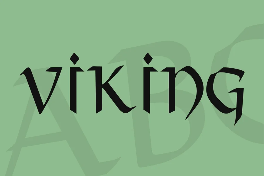
Key Characteristics of Viking Font Styles
Viking fonts are usually characterized by sharp edges, heavy vertical lines, and ornamentation which are as though carved lines. Triangular forms, long serifs, and symmetry are also frequently used in designs in reference to a runic appearance.
Boldness is another characteristic of it. The letters are usually heavy and down-to-earth. This makes the typography possess an impressive effect hence its wide application in logos, name titles in games and works of fantasy nature.
Certain Viking fonts are more reminiscent of actual runic fonts, whereas others are a mix of Norse fonts and the contemporary Latin fonts. The outcome is a variety of styles. Some of them are very readable and can be used in headlines, whereas others are more ornamental and should be used sparingly.
Designers also play around with texture. The font can be made to look old by a distressed or stone-carved look. The metal finish or carved appearance can add to the correlation to weapons, armor, and shields about the image of Vikings.
Viking Font in Modern Media and Pop Culture
The revived interest in Norse in the popular culture has led to renewed interest in Viking-style lettering. Atmospheric typography is often created with bold, rune-inspired typography in films, television series, and video games.
To illustrate, such productions as Vikings contributed to the revival of Norse history in general discourse. The visual branding of the show tended to use bold, angular letterforms reminiscent of carvings of an ancient nature.
On the same note, the video game Assassin Creed Valhalla promotes with Norse typography. The font type supports the setting of the game in England and Norway of the 9 th century.
Even the universe of Marvel has made the aesthetics of Vikings gain popularity. The Norse mythology is heavily influenced in the character Thor. Designs of promotions of Thor related films tend to be dramatic and metallic fonts that are powerful and ancient.
These cultural factors have resulted in the increased accessibility and recognition of Viking font styles. What was a niche aesthetic has become a mainstream design.
Where and How to Use Viking Font Effectively
There has to be balance when using a Viking font. Its decorative and bold character makes it suitable in certain situations.
It works best with logos, which are history-based, mythology-based or strength-based branding. This style is also common among fitness brands, metal bands, craft breweries and fantasy authors who want to create a rugged image.
Medieval fair posters or Viking festival posters are also affected by this typography. The angular lines immediately give the impression of a historical or mythical theme.
Nevertheless, one should not rely on it too much. The existence of long paragraphs written in a highly stylized Viking font may make them hard to read. More often, numerous designers apply it in titles, headings, or brief phrases and combine it with a lighter body typeface.
Contrast also matters. Strauss of Vikings and a simple body font which is not a serif can be incorporated in the hierarchy to look pleasing to the eyes. This style makes the design dramatic, but readable.
The choice of colors can also be used to boost the effect. Natural materials such as wood and stone are abducted in the earthly colors of deep brown, charcoal and dark red. Silver and bronze metallic colors bring up weapons and armor.
Read More: Wanted Font Style Guide for Bold Creative Projects
Differences Between Runic Alphabets and Modern Viking Fonts
Albeit the use of the terms interchangeably by many people, the use of runic alphabets and contemporary Viking font designs are not interchangeable.
There are runic systems like Elder Futhark and Younger Futhark that were a system of writing that was used to communicate. The runes had a certain acoustic content and occasionally a symbolic meaning. These letters were useful and practical.
Contemporary types of fonts inspired by Vikings are, however, generally stylized forms of the Latin alphabet. They replicate the visual touch of runes, but are still decipherable to modern viewers. Angular strokes and sculpted designs are adopted by designers as a part of the standard letters A, B, and C.
Other specialty fonts are trying to copy genuine runes, either as a piece of art or as an educational resource. But these are not necessarily readable by anyone unless that viewer knows the runic system.
Authentic runic scripts are preferable when it is essential to ensure accuracy, as it is the case with historical research or museum displays. A stylized Viking font, built on Latin characters, would be more useful in the case of branding or creative projects.
Design Tips for Creating a Custom Viking Font Look
To make your own Viking-style lettering, begin by learning about actual inscriptions of runic. Be aware of the straight lines and the proportions.
Keep the structure simple. Avoid excessive curves. Pay attention to good vertical and diagonal lines. Symmetry may be used to establish feeling of stability and power.
Authenticity can be provided by the texture. Laying a stone or wood grain effect over the letters may cause them to feel carved as opposed to printed. Depth may be simulated by shadows and highlights.
Another relevant factor is spacing. Due to the boldness of these letterforms, it is enough to provide spacing between characters and avoid the cramped appearance of the text.
Finally, think about context. A Viking font that is applied to a children project will have to be adventure-like, but not threatening. In the case of a heavy metal album cover, a more melodramatic and violent variant would be better.
The key is intention. All the design choices must support the message that you are trying to convey.
Final Thought
Viking fonts are still fascinating to designers and the viewers, as they provide a linkage between the contemporary creative world and the ancient past. These typefaces have a feeling of power, history, and myth, as they are based on the angular runes, which Norse societies used to carve.
This formidable lettering can give a design an instant makeover whether it is in branding, entertainment and personal artwork. When used well and mixed with the other components, it produces a strong visual effect yet not too intense to the viewer.
Knowing its history and the stylistic peculiarities, you will be able to apply Viking-inspired typography in a manner that will seem natural, balanced, and appealing to the eye.
FAQs
What is a Viking font?
A Viking font is a typeface inspired by ancient Norse runes and the visual style of Viking-era inscriptions, often featuring angular and bold letterforms.
Are Viking fonts historically accurate?
Most modern Viking-style fonts are inspired by runes but use the Latin alphabet, so they are not fully historically accurate.
Where can Viking font be used?
It is commonly used in logos, posters, game titles, book covers, and designs related to Norse mythology or medieval themes.
Is Viking font suitable for long text?
It is generally better for headlines and short phrases because its decorative style can reduce readability in long paragraphs.
What is the difference between runes and Viking fonts?
Runes were actual writing systems used in the Viking Age, while modern Viking fonts are stylized typefaces inspired by those ancient symbols.