
Cinzel Font – A Timeless Serif for Elegant Design
Cinzel font is one such typeface that gives one the impression of power and elegance. At the very sight, it is classical, ordered, and sophisticated. This serif typeface is based on the historical inscriptions of the ancient Romans, and it adds life to the digital design of the present generation. Yet it does not feel outdated. Rather, it is deliberate and authoritative.
In an effort not to overpower a layout, designers tend to seek fonts that are personal. Herein lies the distinction of Cinzel font. It is a mixture of traditional influences in letterform and pure digital implementation. It gives a sense of sophistication that is hard to achieve whether applied in branding, headlines or editorial layouts.
The Origins and Inspiration Behind Cinzel Font
Natanael Gama created Cinzel font and published it in Google Fonts. It is mainly inspired by the classical Roman inscriptions. The inscriptions on monuments like the Trajans column are generally regarded as among the best illustrations of serif typeface design ever.
These inscriptions that were ancient were well balanced. The letters were cut into stone and made very sharp and dramatic with thick and thin strokes. Cinzel font is that visual tradition made in a present-day type system.
Instead of replicating the ancient forms, the designer perfected them to be used by modern people. Spacing was also modified to be readable in digital mode. Further weights were designed. What we have is a font that does justice to classical design and works perfectly on screens and print.
Key Features That Define Its Style
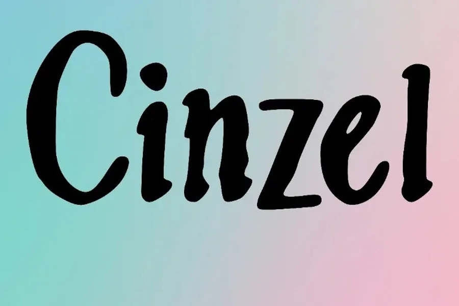
Cinzel font has a unique engraved look and that is what makes it easily recognizable. The letters are broad and erect. The heavy vertical lines and their contrasting thin horizontal elements are vivid. The serifs are crisp and outlined and this contributes to its architectural sense.
Initially, the design was characterized by intense emphasis on the use of uppercase letters, which was the Roman influence. Overtime, expanded versions added more flexibility e.g. variations that could be used in wider design applications. Nevertheless, the font is actually glowing in capitalized headlines and display settings.
Its ratios are well balanced. The characters are all purposeful and balanced. This renders it highly efficient regarding projects which demand a formality and control to some extent. Spacing of letters also is significant. With sufficient breathing space, the typeface appears majestic and stately.
It is, however, most appropriate to titles instead of long paragraphs due to its high contrast and dramatic effect. The details can be burdened in huge blocks of text. In the case of body copy, designers tend to use it together with a less complex companion font.
Read More: One Piece font Style Guide for Fans and Designers
Best Use Cases in Modern Design
Cinzel font has been used extensively in branding in which it is intended to convey tradition, prestige or power. The tone of the text is usually fine in luxury brands, editorial publications and formal event materials.
Classical inspired serif fonts are prevalent in entertainment and movie branding. A famous Roman-inspired typography that can be observed is advertising Gladiator. Although they are not exactly the same, the visual mood is in line with the same historical factor that influenced Cinzel font.
With websites it is effective in hero boxes and massive headings. It is impressive without being decorative or whimsical. Print It is best in book covers, certificates, invitations, and expensive packaging.
Clarity is also valued by logo designers. The bold vertical lines contribute to the establishment of the marks which appear to be stable and firm. In combination with minimalistic designs, the font may appear both modern and classic.
Pairing Cinzel Font with Other Typefaces
Bad typography hardly ever concerns a font or typeface. The interaction between the different typefaces can radically end up in the final design. Cinzel font is a bold font and therefore it is important to match it up appropriately.
It is effective especially with clean fonts of the serif type. A plain without serif offers a contrast and enhances a readability of body text. The simplicity of the secondary font enables the serif headline to be the center of focus.
The other solution is to support text using a lighter serif with with less contrast. This ensures a unity of tone and less visual competition. The key is balance. In case both fonts are dramatic, the layout may be oppressive.
Spacing also matters. Cinzel font has carved elegance that is made more beautiful through generous margins and considerate line spacing. Close arrangements may lessen its effect and give the text a claustrophobic look.
Strengths and Limitations to Consider
Cinzel font has a classic nature which is one of its greatest strengths. Since it is based on classical Roman letterforms, it does not sense itself stuck in the moment in design. This makes it a sure thing as far as projects that are supposed to last are concerned.
Another advantage is accessibility. It is convenient to use in the web design because it is available in Google Fonts, and there is no concern about licensing. This is one of the conveniences attributed to its general popularity.
Nevertheless, it does not necessarily fit everywhere. Its officiality might not result in the playful or casual branding. It can be too traditional among the startups with laid-back or experimental identities.
Another factor is readability. Though beautiful in headlines, it does not translate as effectively in the long body text. The issue of hierarchy and usage should be thought over by designers to achieve the most optimal results.
The realization of its strengths and limits prevents its application without purpose, that is, just because it seems to be impressive.
Final Thought
Cinzel font is an example of the way classical inspiration can be prosperous in the field of design today. It forms a connection between the past and modern aesthetics by reviving ancient Roman letterforms to be used in digital form.
It can be said it is strong through its presence. It is comfortable, organized and graceful. Properly applied, it makes branding, headlines and editorial work seem permanent.
The trick to the prescribed is moderation. Let it dominate the settings of displays. Back it up with clean secondary typography. Give it space to breathe. It is a simple text which can be dignified and memorable when handled with care.
FAQs
What is Cinzel font mainly used for?
Cinzel font is mainly used for headlines, logos, invitations, book covers, and branding projects that require a classic and elegant appearance.
Is Cinzel font free for commercial use?
Yes. It is available through Google Fonts under an open-source license, which allows both personal and commercial use.
Is Cinzel font suitable for body text?
It can be used for short passages, but it is generally better suited for headings and display purposes due to its strong contrast and sharp serifs.
What design style does Cinzel font represent?
It represents a classical Roman inscription style adapted into a modern digital serif typeface.
Does Cinzel font pair well with sans serif fonts?
Yes. It pairs very well with clean sans serif fonts, which help balance its dramatic and formal character.