
From Cluttered Logbooks to Clean Dashboards: The UX Behind a Great Mileage Tracking App
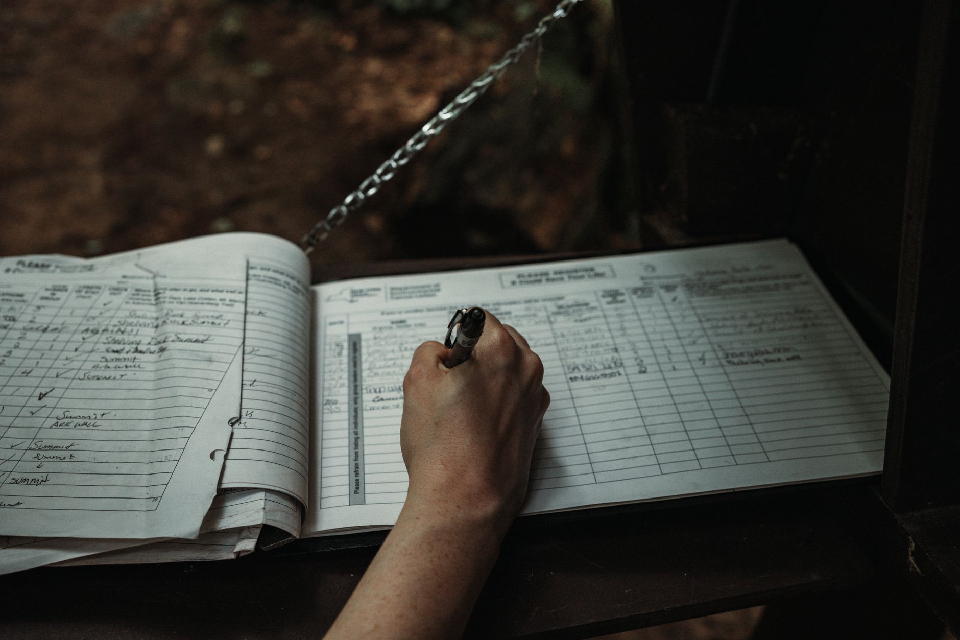
Good design is invisible. You notice bad tools constantly and good ones almost never, because the good ones get out of your way. Nowhere is this clearer than in the humble category of expense tracking, where a beautifully designed product can mean the difference between a habit you keep and one you abandon by February. A Mileage Tracking App lives or dies on this principle: if logging a trip takes effort, people stop doing it, and the entire purpose collapses. The best apps in this space are quiet case studies in user experience, turning a tedious chore into something that happens almost on its own.
The design problem hidden in a boring task
On the surface, tracking mileage seems trivial. You drove somewhere for work, you write down how far. But the real design challenge is brutal: the task is frequent, low-reward, and easy to skip. People have to do it every single time they drive, they get nothing satisfying in the moment, and the payoff is months away at tax time.
That combination is a designer's nightmare. It means:
- High frequency demands near-zero friction per use.
- No immediate reward removes the natural motivation to continue.
- Delayed payoff makes it easy to rationalize skipping "just this once."
A great mileage app has to overcome all three with design alone. The brilliance is in how it does so.
Removing the start: automatic detection
The first and most important design decision is eliminating the moment of effort entirely. Older logbooks and basic apps required you to remember to start tracking before each drive. That single requirement is where most people fail, because remembering is hard and forgetting is free.
The elegant solution is automatic detection. The app uses your phone's motion and location sensors to notice when you are driving and records the trip without you lifting a finger. The design lesson is universal:
The most reliable user action is the one the user never has to take.
By removing the start step, the app sidesteps the biggest point of failure in the entire workflow.
The one-swipe decision
Once a trip is captured, the user still has to make one choice: was this business or personal? This is the only unavoidable human input, so good design makes it as fast and pleasant as possible.
The best implementations reduce it to a single gesture:
- Swipe right for business
- Swipe left for personal
This is the same interaction pattern that made dating apps and email triage feel effortless. It works because it respects the user's time and attention. A decision that could have been a form with five fields becomes a flick of the thumb. The interface does the remembering, the categorizing, and the math. The human does one swipe.
Why the dashboard matters
If automatic detection and one-swipe classification handle the input, the dashboard handles the motivation. Because the real reward is months away, a well-designed app creates smaller, immediate rewards through clear visualization.
A strong dashboard typically shows:
|
Element |
What it gives the user |
|
Running deduction total |
A live sense of money earned back |
|
Miles this month |
Progress at a glance |
|
Business vs personal split |
Confidence the log is accurate |
|
Trip history |
Reassurance that nothing was lost |
Seeing a deduction total climb week by week supplies the dopamine the task itself lacks. It converts an abstract future benefit into a visible, growing number today.
The design principles that make it work
Strip away the specifics and the same handful of UX principles appear in every well-made tracking app:
- Reduce friction to near zero. Every removed tap increases the odds the habit survives.
- Automate the unreliable parts. Anything that depends on memory should be handled by the system.
- Make the one required action delightful. If the user must act, the action should take a second and feel good.
- Visualize delayed rewards. Show progress now to motivate behavior whose payoff is later.
- Build trust through transparency. Clear records reassure users their data is complete and correct.
These principles are not unique to mileage. They are the foundation of any product that asks people to do a small, repetitive task consistently.
Typography and clarity in financial tools
There is a quieter layer of design that matters enormously in a tool dealing with money: legibility. Financial information has to be read accurately and quickly, often in less than ideal conditions like a car parked in bright sun. Thoughtful type and layout choices do real work here:
- Clear numeric hierarchy so the deduction total reads instantly
- Generous spacing so trips do not blur together
- Restrained color so business and personal are distinguishable at a glance
- Readable type sizes so a quick check does not require squinting
When a tool handles your taxes, ambiguity is not a style flaw, it is a liability. Good typographic design here is a form of trust.
What happens when design fails
It is worth looking at the failure case to appreciate the good one. A poorly designed mileage tool tends to share these traits:
- It requires manual start, so trips get missed.
- It buries classification in menus, so users give up.
- It hides the payoff, so motivation evaporates.
- It clutters the screen, so the important numbers get lost.
The predictable result is abandonment. The user installs it with good intentions, struggles for two weeks, and quietly stops. The deduction they meant to capture slips away, not because the tax rules failed them, but because the design did.
The broader takeaway for any product
The mileage app is a perfect miniature of a much larger truth in product design: behavior follows friction. If you want people to do something consistently, you do not lecture them about discipline. You design the friction out of the task until doing it is easier than not doing it.
The best mileage trackers prove that even the most tedious, low-glamour task can become effortless with the right design choices. Automate what can be automated, reduce the rest to a single delightful gesture, and make the reward visible. Do that, and a chore people universally avoid becomes a habit they keep without thinking.
The bottom line
A mileage tracking app is not really about miles. It is about designing for human behavior, specifically the challenge of getting people to do a small, unrewarding task over and over. The apps that succeed do it through invisible automation, a single satisfying swipe, and a dashboard that makes a distant payoff feel present. It is a masterclass in quiet, functional design, and proof that the best user experience is often the one you never notice at all.